
Milton and Oakville, two suburbs west of Toronto, share a border. Since early 2022, the typical detached home in Milton has fallen 41% in the Toronto Regional Real Estate Board's (TRREB) price index. In Oakville, it's down 28%.
Across TRREB's whole area, roughly the Greater Toronto Area (GTA), detached prices sit about a third below where they were in early 2022. Between August and September they slipped another 1.1%, and every market on the graph fell except Ajax. Those numbers are accurate and not very useful, because they blend a lot of very different stories. So I pulled the numbers for 15 markets, detached homes only, straight from TRREB. Here's how far each one sits below its 2022 peak.
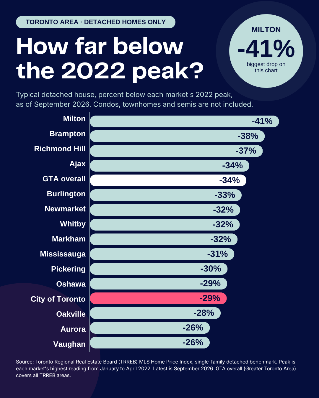
Three things stand out.
The worst of it was concentrated. Milton (-41%), Brampton (-38%) and Richmond Hill (-37%) fell well past the GTA overall (-34%). Ajax (-34%) just edged past it, and no other market fell further.
The softest landings were Vaughan (-26%), Aurora (-26%) and Oakville (-28%). Same rate hikes, same stress test, a much gentler ride.
The City of Toronto landed toward the gentler end at -29%. Eleven of the other 14 markets fell further, though several only by a point or two. So "the suburbs got hit harder than the city" is mostly true and still misses the point. Milton and Aurora are both suburbs, and they're 15 points apart.
The trigger isn't a mystery. The Bank of Canada raised its overnight rate from 0.25% in March 2022 to 5% in July 2023, roughly 16 months and 4.75 percentage points. Prices peaked in early 2022, just as the hikes began.
The stress test made it bite harder. For uninsured mortgages, federally regulated lenders have to qualify you at the greater of your contract rate plus 2 percentage points or 5.25% (OSFI). Higher rates meant a bigger payment and a higher qualifying rate, so buying power took a hit twice.
A rough illustration: on an $800,000 mortgage amortized over 25 years, the monthly payment at 3%, about where the best five-year fixed rates were in February 2022, is about $3,790. At 6.09%, the five-year rate in TRREB's September Market Watch, it's about $5,160, roughly 36% more. Flip it around and the same $3,790 payment borrows about $587,000 at 6.09%, which is 27% less. GTA prices are down about 34%, so measured by the monthly payment, the discount in this example is closer to 10%. Round numbers for illustration, not a rate quote.
What the data can't tell us is why Milton fell further than Oakville. TRREB's index measures how far prices moved, not who was behind the move. A few guesses worth testing: how much buyers stretched to get in near the top, how much new-build and investor-owned supply a market had, and how many owners had to sell versus could wait it out. These are guesses, not findings.
If you own: the headline number matters less than your own. Someone who bought in early 2022 and someone who bought years earlier are in very different places, even on the same street. Find your suburb on the graph, then compare it to what you paid.
If you're buying: don't treat the 2022 peak as the yardstick. A home that's down 30% from peak isn't automatically a 30% bargain. Compare it to what similar homes have sold for recently and what it costs to carry each month. Early 2022 prices came with five-year mortgage rates around 3%, about half of today's, which makes "percent off peak" a flattering way to describe a discount.
If you're selling: your buyer is looking at the same numbers you are. Price to what has actually sold in your own neighbourhood lately, not to the 2022 figure in your head.
The price numbers come from TRREB's MLS Home Price Index public tables, for detached homes only. For each market, "peak" is its highest index reading from January to April 2022, and "now" is September 2026. The graph shows the percentage change in the index, not a dollar drop, so it won't match charts that report dollar declines. The index tracks benchmark prices, meaning a typical home with the same features over time, so it isn't thrown off by which homes happened to sell that month. That's different from average sale prices, which swing with the mix. "GTA overall" is TRREB's all-areas detached index.
The graph is the weather report for the whole market. It can't tell you whether your street got rained on. If you'd like to know where your own home sits, message me and I'll pull the numbers for your neighbourhood.
Across TRREB's whole area, roughly the Greater Toronto Area (GTA), detached prices sit about a third below where they were in early 2022. Between August and September they slipped another 1.1%, and every market on the graph fell except Ajax. Those numbers are accurate and not very useful, because they blend a lot of very different stories. So I pulled the numbers for 15 markets, detached homes only, straight from TRREB. Here's how far each one sits below its 2022 peak.
What the graph shows
Three things stand out.
The worst of it was concentrated. Milton (-41%), Brampton (-38%) and Richmond Hill (-37%) fell well past the GTA overall (-34%). Ajax (-34%) just edged past it, and no other market fell further.
The softest landings were Vaughan (-26%), Aurora (-26%) and Oakville (-28%). Same rate hikes, same stress test, a much gentler ride.
The City of Toronto landed toward the gentler end at -29%. Eleven of the other 14 markets fell further, though several only by a point or two. So "the suburbs got hit harder than the city" is mostly true and still misses the point. Milton and Aurora are both suburbs, and they're 15 points apart.
Rates started it. The data can't say why some suburbs fell further.
The trigger isn't a mystery. The Bank of Canada raised its overnight rate from 0.25% in March 2022 to 5% in July 2023, roughly 16 months and 4.75 percentage points. Prices peaked in early 2022, just as the hikes began.
The stress test made it bite harder. For uninsured mortgages, federally regulated lenders have to qualify you at the greater of your contract rate plus 2 percentage points or 5.25% (OSFI). Higher rates meant a bigger payment and a higher qualifying rate, so buying power took a hit twice.
A rough illustration: on an $800,000 mortgage amortized over 25 years, the monthly payment at 3%, about where the best five-year fixed rates were in February 2022, is about $3,790. At 6.09%, the five-year rate in TRREB's September Market Watch, it's about $5,160, roughly 36% more. Flip it around and the same $3,790 payment borrows about $587,000 at 6.09%, which is 27% less. GTA prices are down about 34%, so measured by the monthly payment, the discount in this example is closer to 10%. Round numbers for illustration, not a rate quote.
What the data can't tell us is why Milton fell further than Oakville. TRREB's index measures how far prices moved, not who was behind the move. A few guesses worth testing: how much buyers stretched to get in near the top, how much new-build and investor-owned supply a market had, and how many owners had to sell versus could wait it out. These are guesses, not findings.
What this means for you
If you own: the headline number matters less than your own. Someone who bought in early 2022 and someone who bought years earlier are in very different places, even on the same street. Find your suburb on the graph, then compare it to what you paid.
If you're buying: don't treat the 2022 peak as the yardstick. A home that's down 30% from peak isn't automatically a 30% bargain. Compare it to what similar homes have sold for recently and what it costs to carry each month. Early 2022 prices came with five-year mortgage rates around 3%, about half of today's, which makes "percent off peak" a flattering way to describe a discount.
If you're selling: your buyer is looking at the same numbers you are. Price to what has actually sold in your own neighbourhood lately, not to the 2022 figure in your head.
Where these numbers come from
The price numbers come from TRREB's MLS Home Price Index public tables, for detached homes only. For each market, "peak" is its highest index reading from January to April 2022, and "now" is September 2026. The graph shows the percentage change in the index, not a dollar drop, so it won't match charts that report dollar declines. The index tracks benchmark prices, meaning a typical home with the same features over time, so it isn't thrown off by which homes happened to sell that month. That's different from average sale prices, which swing with the mix. "GTA overall" is TRREB's all-areas detached index.
- TRREB MLS HPI public tables: September 2026
- TRREB MLS HPI public tables, 2022: January, February, March, April
- TRREB Market Watch (for the mortgage rate): September 2026
- Early-2022 mortgage rates: Remitbee, February 2022
- OSFI: minimum qualifying rate for uninsured mortgages
- Bank of Canada rate announcements: March 2022, July 2023
Want your street's number?
The graph is the weather report for the whole market. It can't tell you whether your street got rained on. If you'd like to know where your own home sits, message me and I'll pull the numbers for your neighbourhood.